Century 21, real estate site
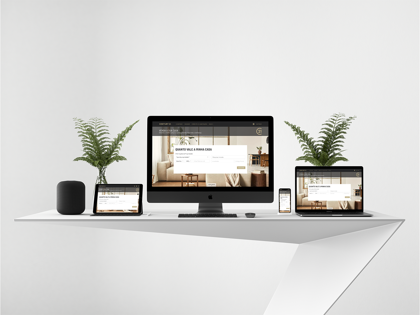
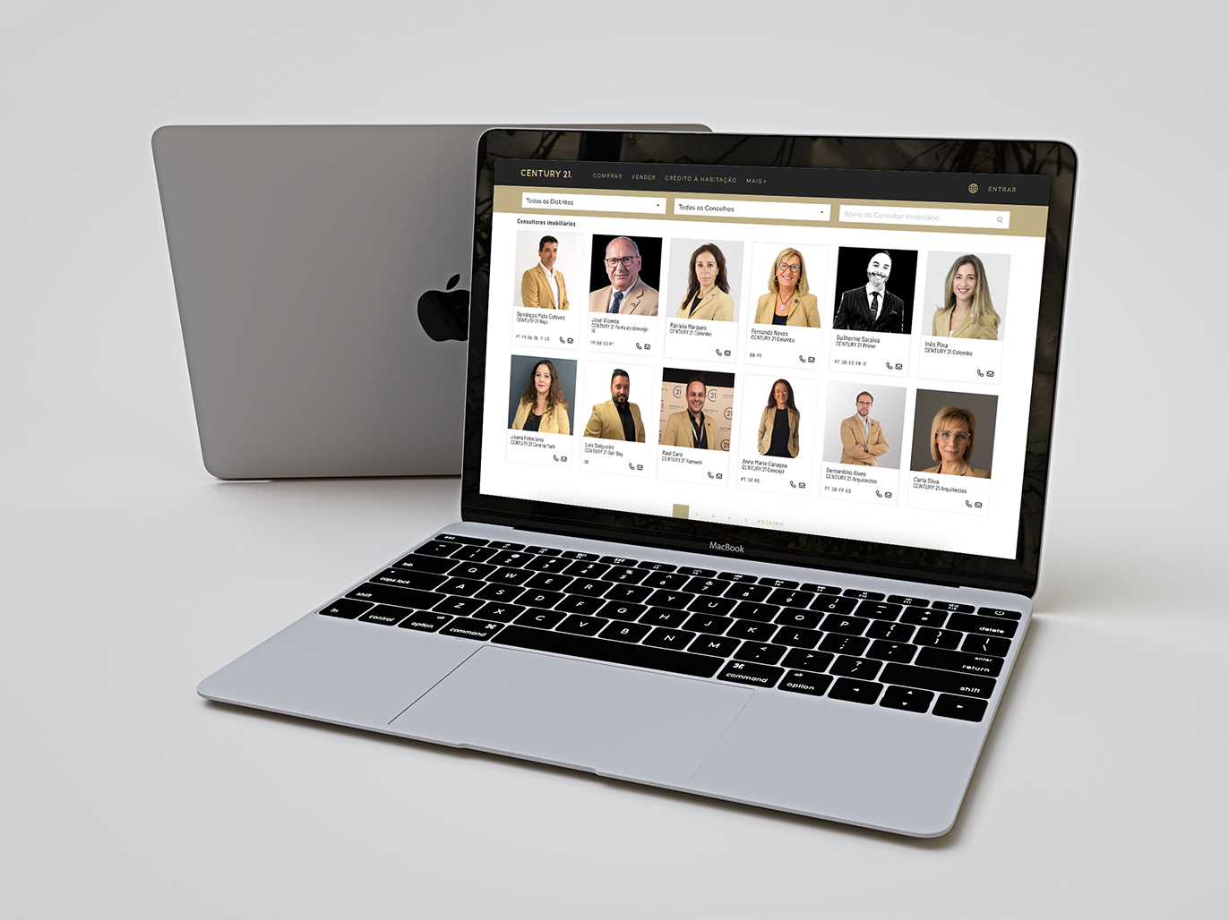
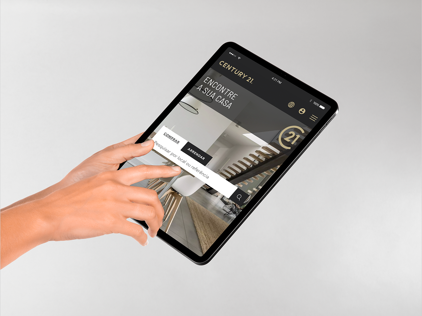
UI/UX design for the Portuguese site of Century 21, one of the biggest names in real estate, built around clarity without losing the brand's polish.
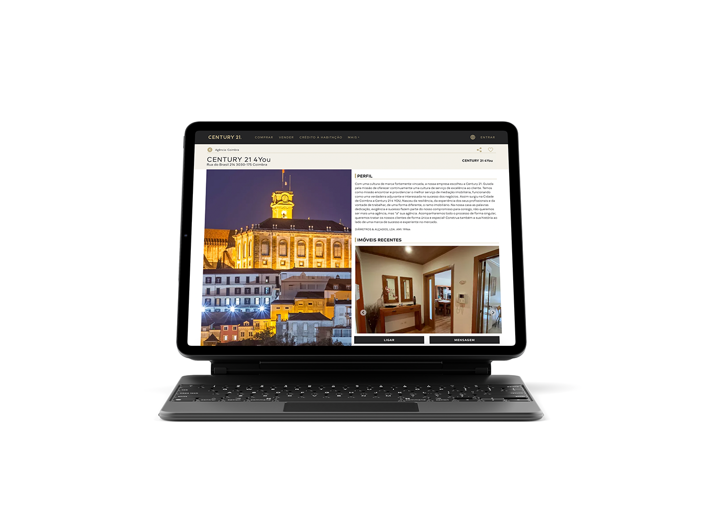
Century 21 is a well-known, established name in Portuguese real estate. The brief was a site that felt objective and easy to use without losing the sophistication the brand already carries, so people could actually enjoy browsing listings instead of just tolerating the process.
User-first screens
Designed every screen as a point of contact, prioritizing the information a visitor actually needs at hand over decoration for its own sake.
Staying on-brand
Kept the layout objective and clean without losing the brand's established sophistication, balancing usability against Century 21's existing visual identity.
A real estate site people actually enjoy browsing, live at century21.pt, built to keep the brand's sophistication intact while putting the useful information within easy reach.