Praiana, brand identity
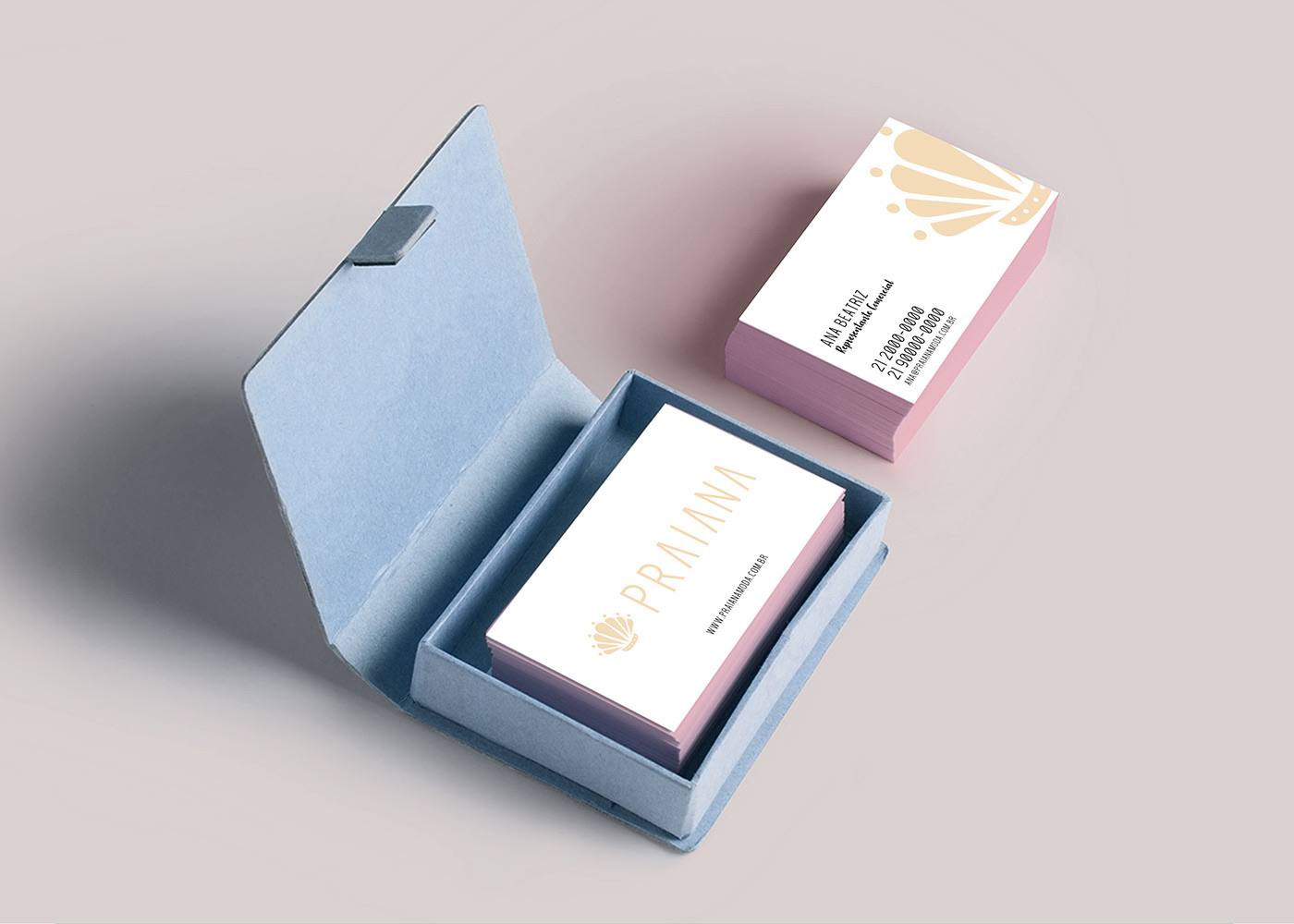
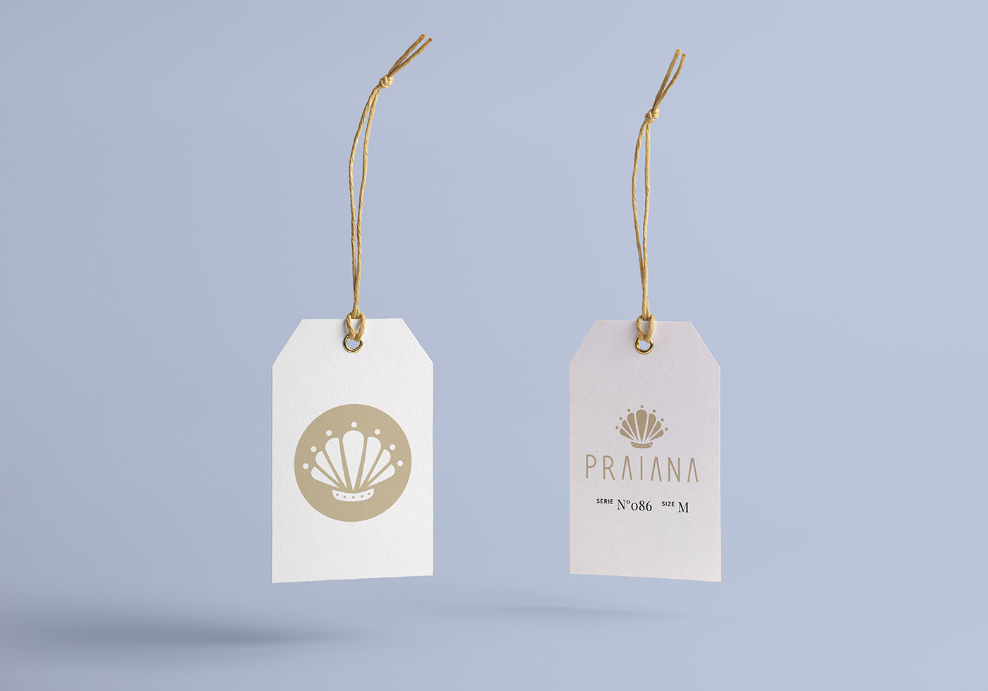
Brand identity for a brand made for beach women: a shell-crown symbol, clean type and colors taken from nature.
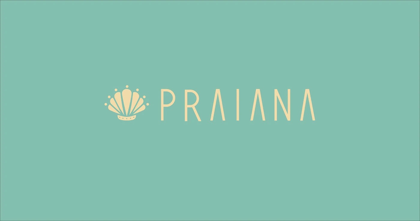
The name Praiana already carries a natural strength: it is how you recognize the people who live, love and reign on the beach. The identity had to turn that into a symbol and a look, keeping the harmony the brand needs to convey.
The symbol
A fusion of shells for the sea, a crown for the idea of reign, and people for the generosity the brand shows its clients.
Type
Simple, objective typography with touches of class and refinement, so the identity stays harmonious.
Color
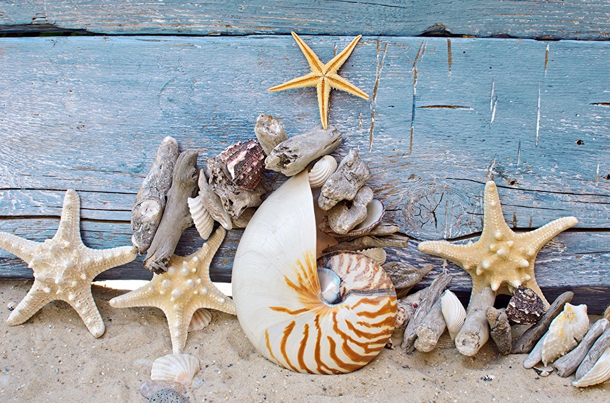
The styles studied are deliberate and the colors were taken from elements of nature, to stay close to the brand's audience: beach women.
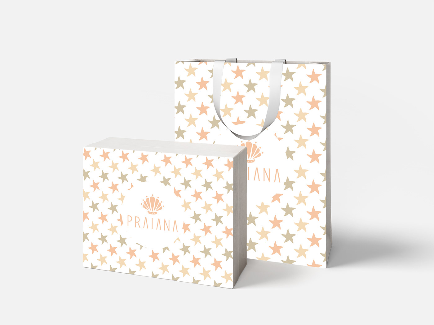
A brand identity published on Behance in February 2018. I also developed a bag and box for the brand.