Z21 Records, brand concept
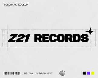
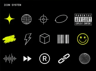
A full brand system for a rap and trap label: mark, wordmark, palette, type, icons, graphics, photography direction and applications, from a CD case to a street wall.
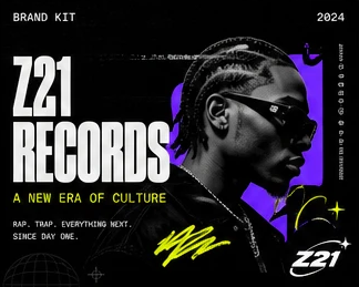
A label that sells itself as "a new era of culture" can't look like a template. The identity had to feel raw, real and iconic, loud enough for an outdoor wall and flexible enough for a CD case.
The mark
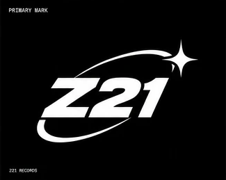
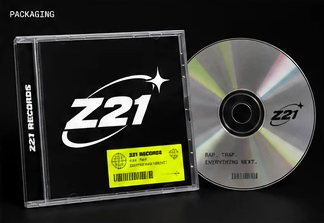
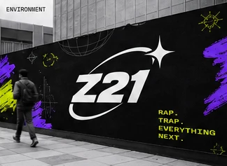
A slanted Z21 wrapped in an orbit with a four-point spark, built to hold up from a CD spine to a building-size wall.
Color and type
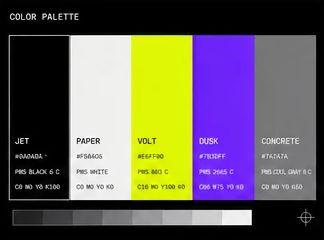
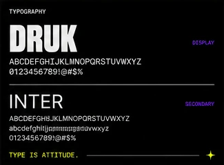
Jet black and paper white as the base, volt yellow-green and dusk purple as the shock accents, set in Druk for display and Inter for support. Type is attitude.
Graphic language and photography
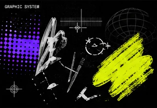
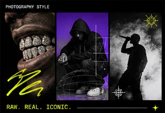
Halftones, wireframe globes, targeting marks and brushed strokes as the graphic kit, with gritty, high-contrast photography: close-up grills, hooded figures, smoke and a mic.
Applications
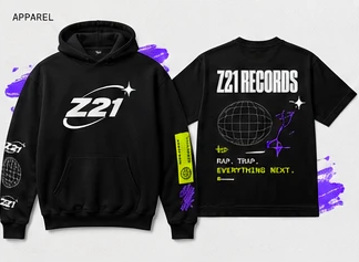
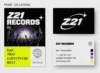
Tested the system on a CD, hoodies and tees, a poster and cards, and an outdoor wall.
A complete identity system across 11 applications, with one clear rule: black base, volt hits, purple energy.
#0A0A0A
#F5F5F0
#E6FF00
#7B3DFF
#7A7A7A